← All work 005 Sakin
Inner peace, made visible.
01 The brief
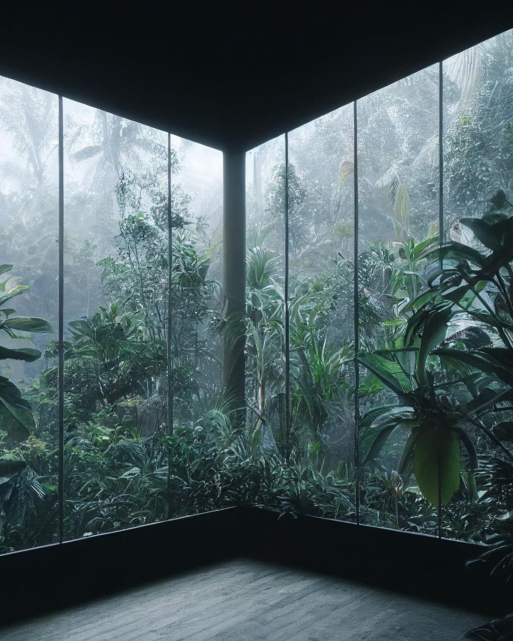
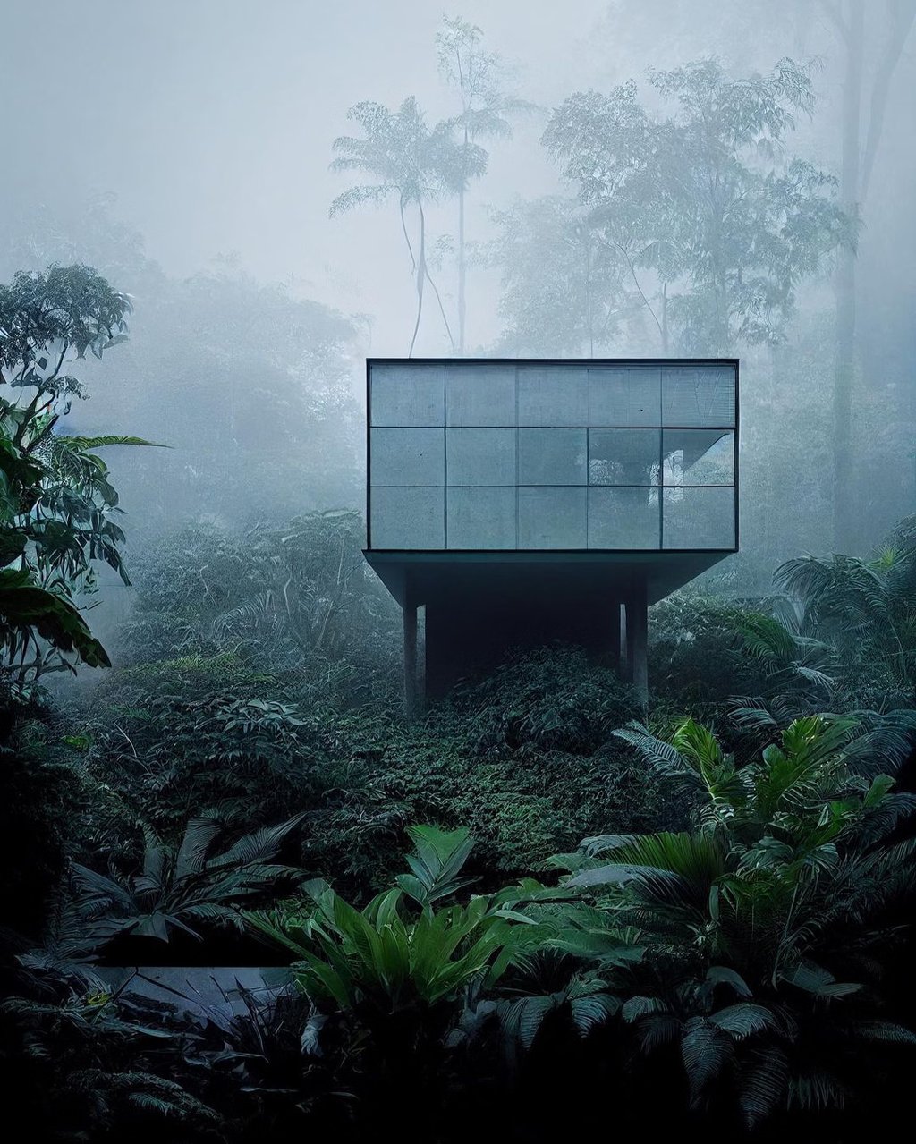
A brand for Sakin, a spiritual guesthouse in Douma, a quiet village in the Lebanese mountains, for people who come to slow down, breathe and reflect.
02 The name
Sakina means inner peace in Arabic. Everything in the brand had to feel like that word: calm, quiet and unhurried.
03 The idea
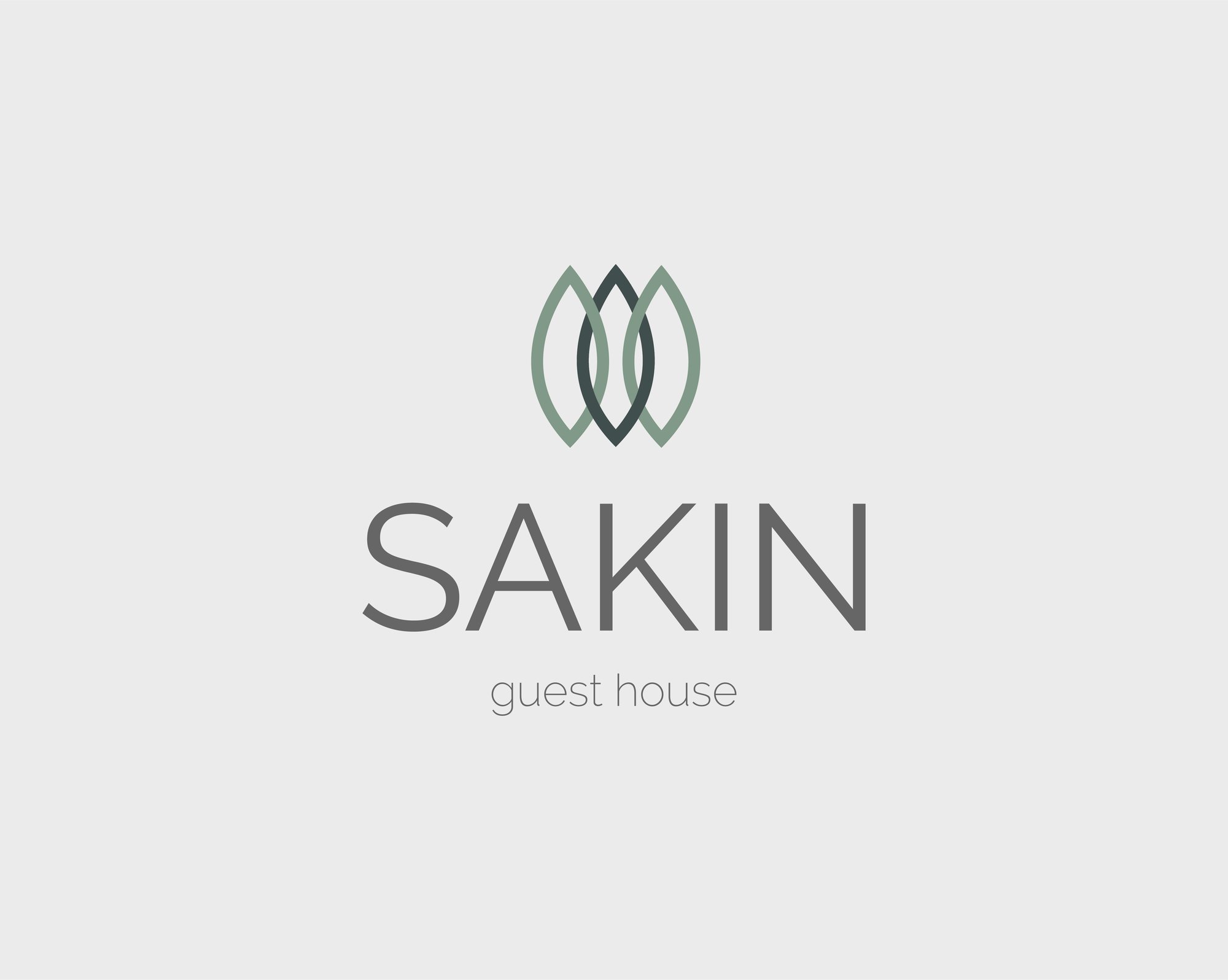
Three connected leaves drawn from the trees around the house: nature, continuity and a return to oneself, in one simple mark.
04 The approach
Don’t overcomplicate it. A soft palette, generous space and a restrained system, carried from stationery and merchandise to a calm website that is easy to use.
The mark
The icon draws from the trees around the guesthouse. Three connected leaf forms reference nature and continuity: a return to balance and to oneself.
Brand collateral
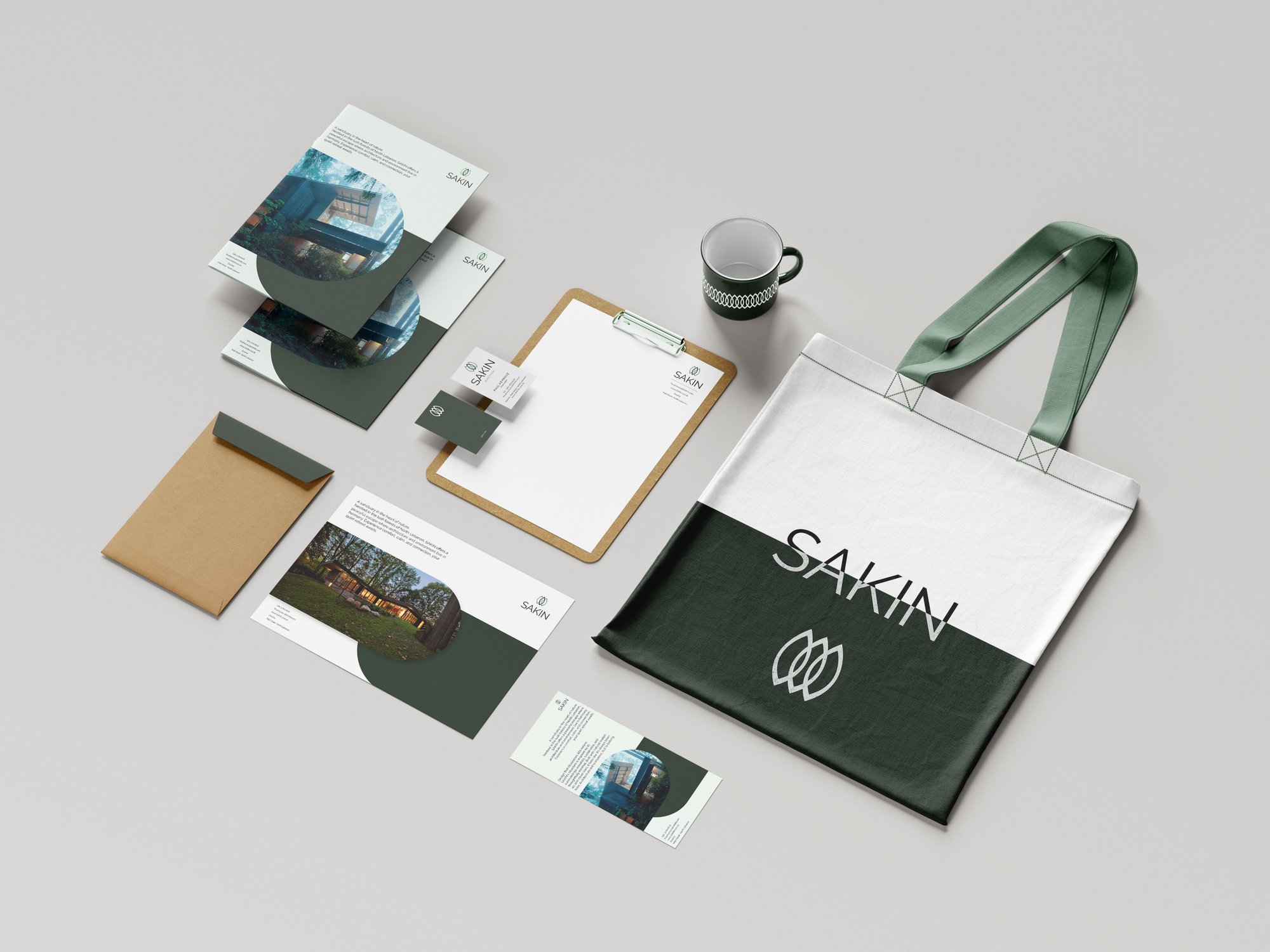
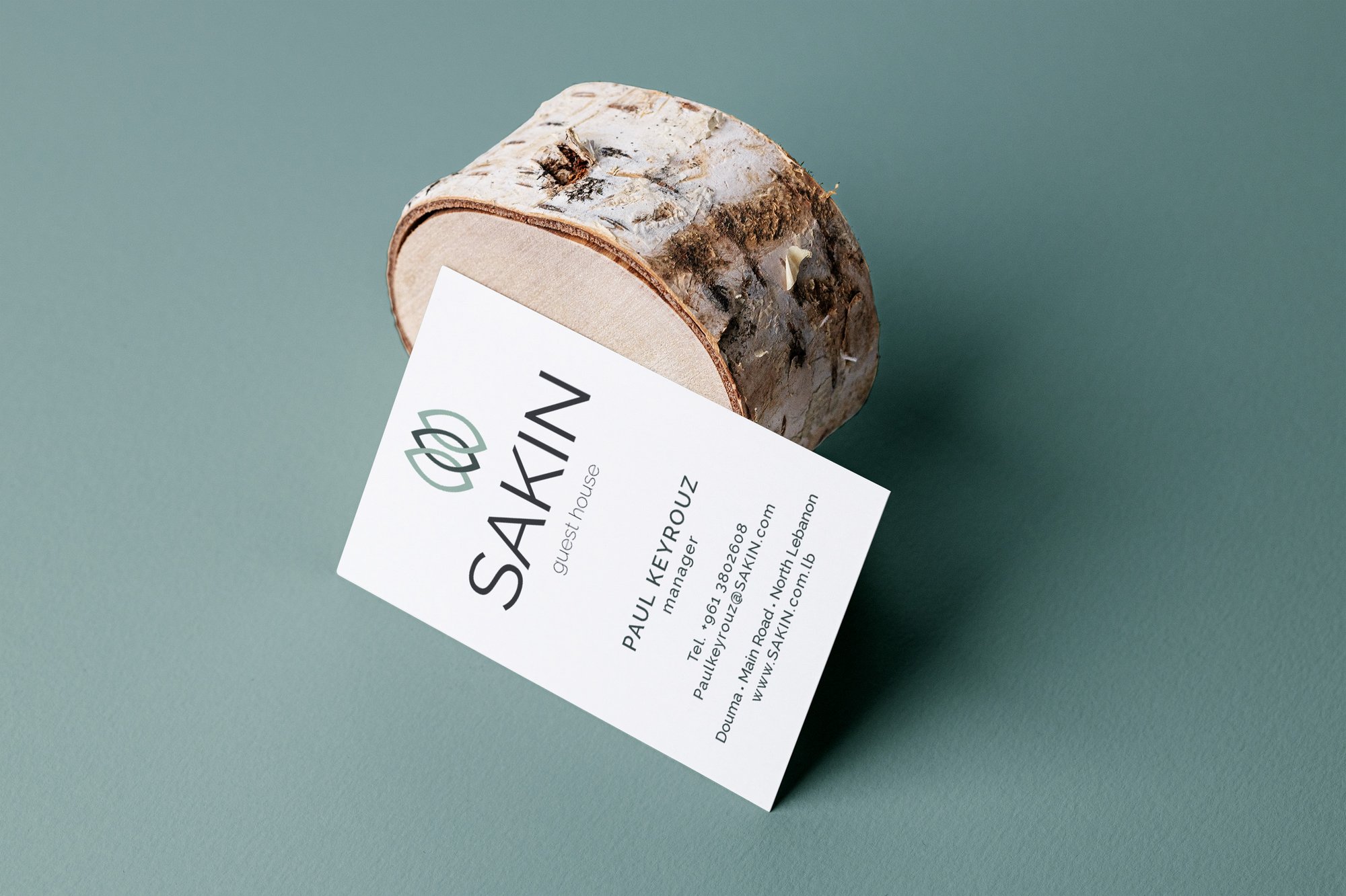
From stationery to merchandise, each piece applies the same restrained language rooted in nature and simplicity, so the brand carries beyond the guesthouse itself.
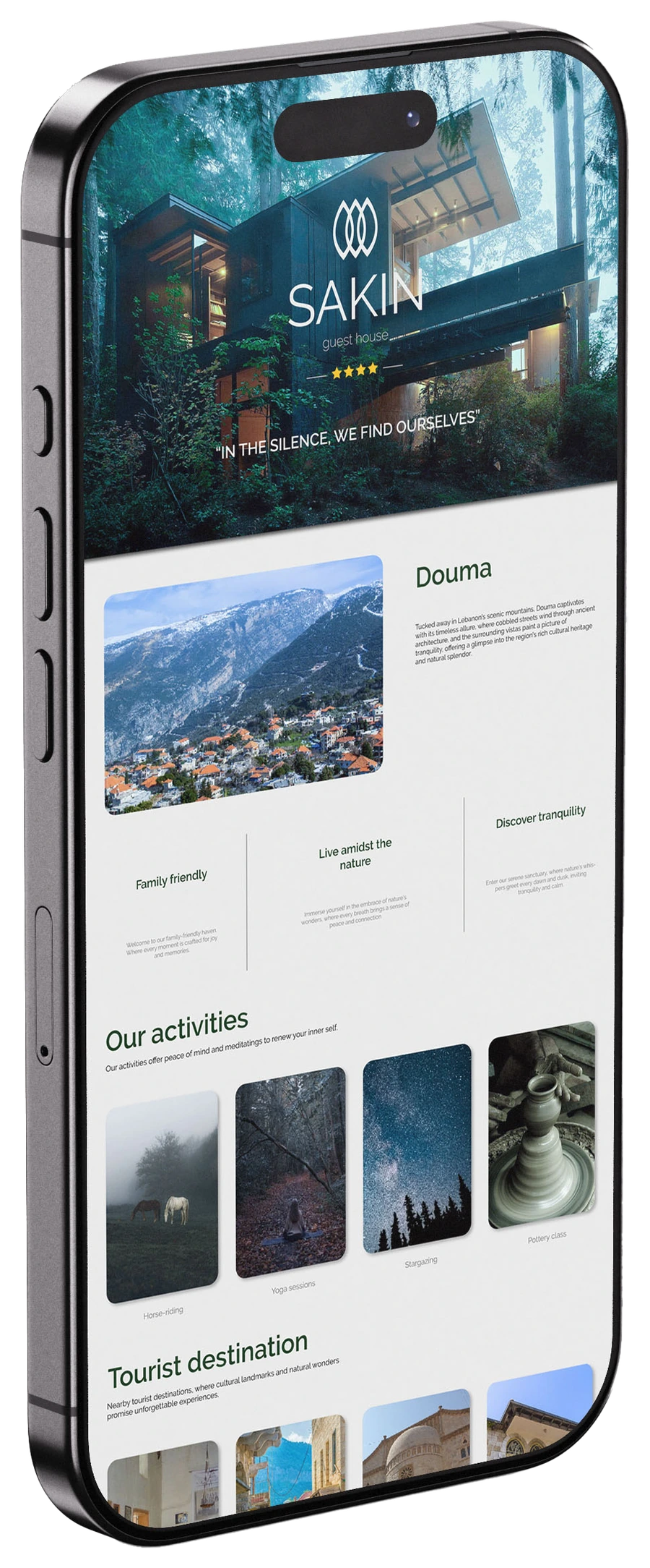
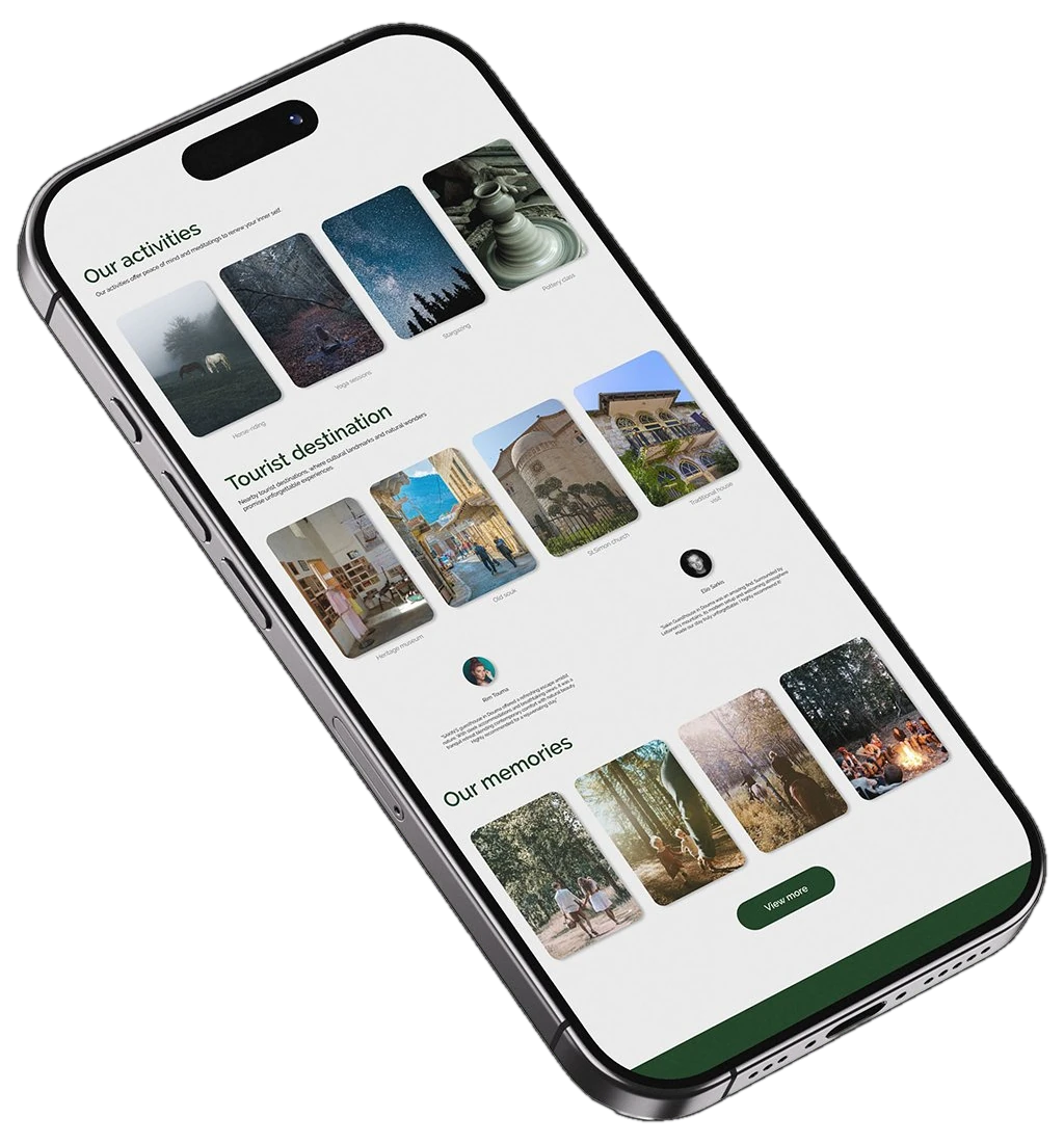
Website
A clear, calm digital experience giving direct access to the guesthouse’s services, activities and surroundings, with a strong visual hierarchy.