← All work 006 Dawboulo
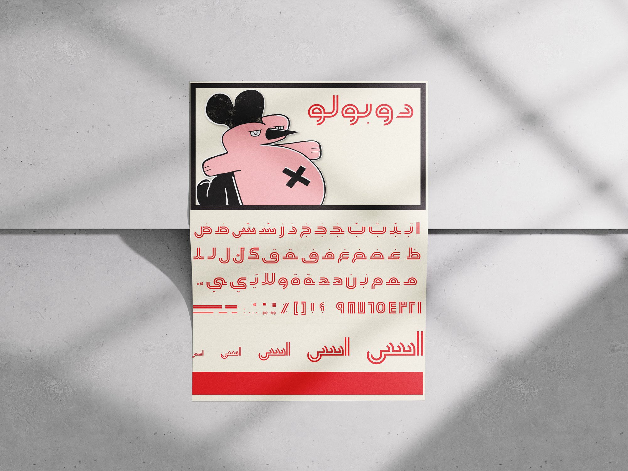
A typeface pulled off a Beirut wall.
01 The brief
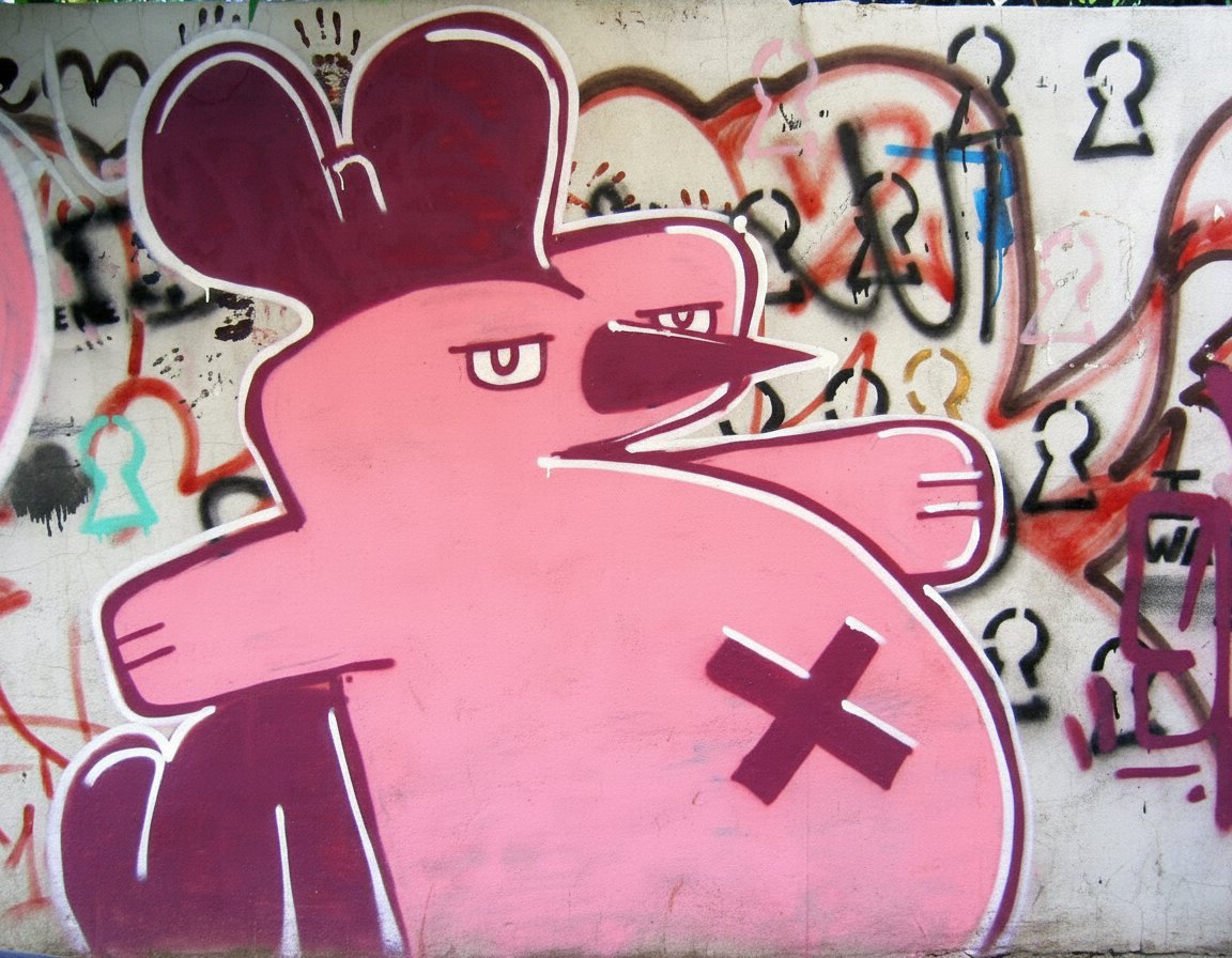
Create a typeface based on a photograph.
02 The choice
I went with a graffiti character I kept seeing around Beirut.
03 The idea
Not a typeface inspired by the artwork, but one made from it: the typeface is the artwork.
04 The approach
Break the character down stroke by stroke, rebuild its curves, angles and weight into a full legible alphabet, then test it on an exhibition poster.
The alphabet
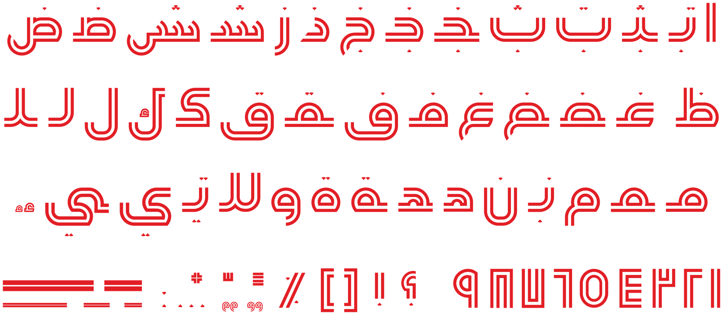
The gestural strokes and thick outlines of the graffiti become a structured Arabic type system. Every glyph keeps the character’s expressive weight while staying legible across the full alphabet.
Dawboulo in use
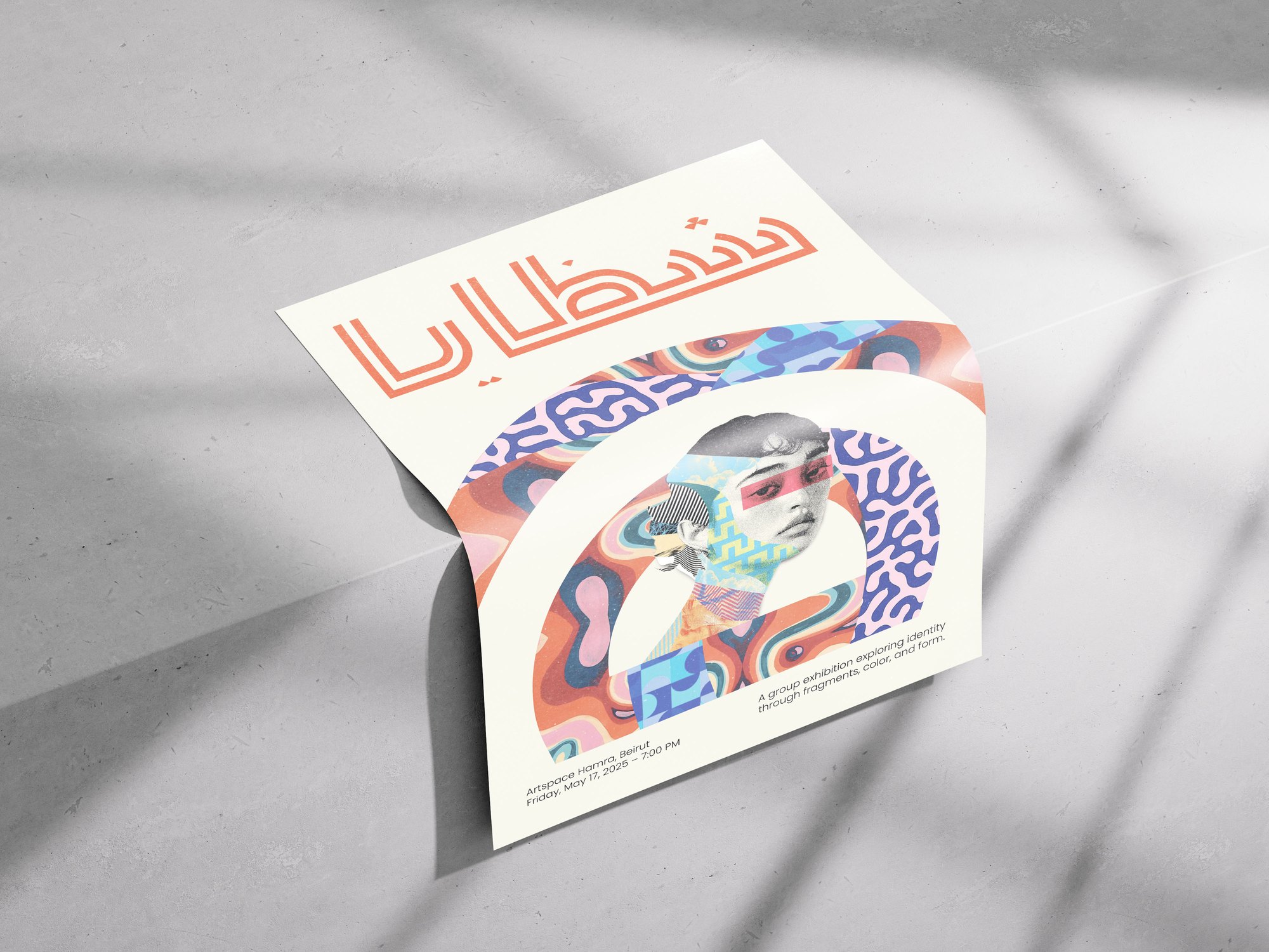
Applied to an exhibition poster, Dawboulo proves itself beyond the street: bold at display sizes, built for cultural events, editorial headlines and any context that needs a strong typographic voice.