← All work 007 GreenGreen
A brand that rings twice, like an alarm.
01 The brief
A fashion brand about eco-friendliness, recycling and awareness.
02 The insight
Awareness means waking people up, so the brand had to work like an alarm.
03 The idea
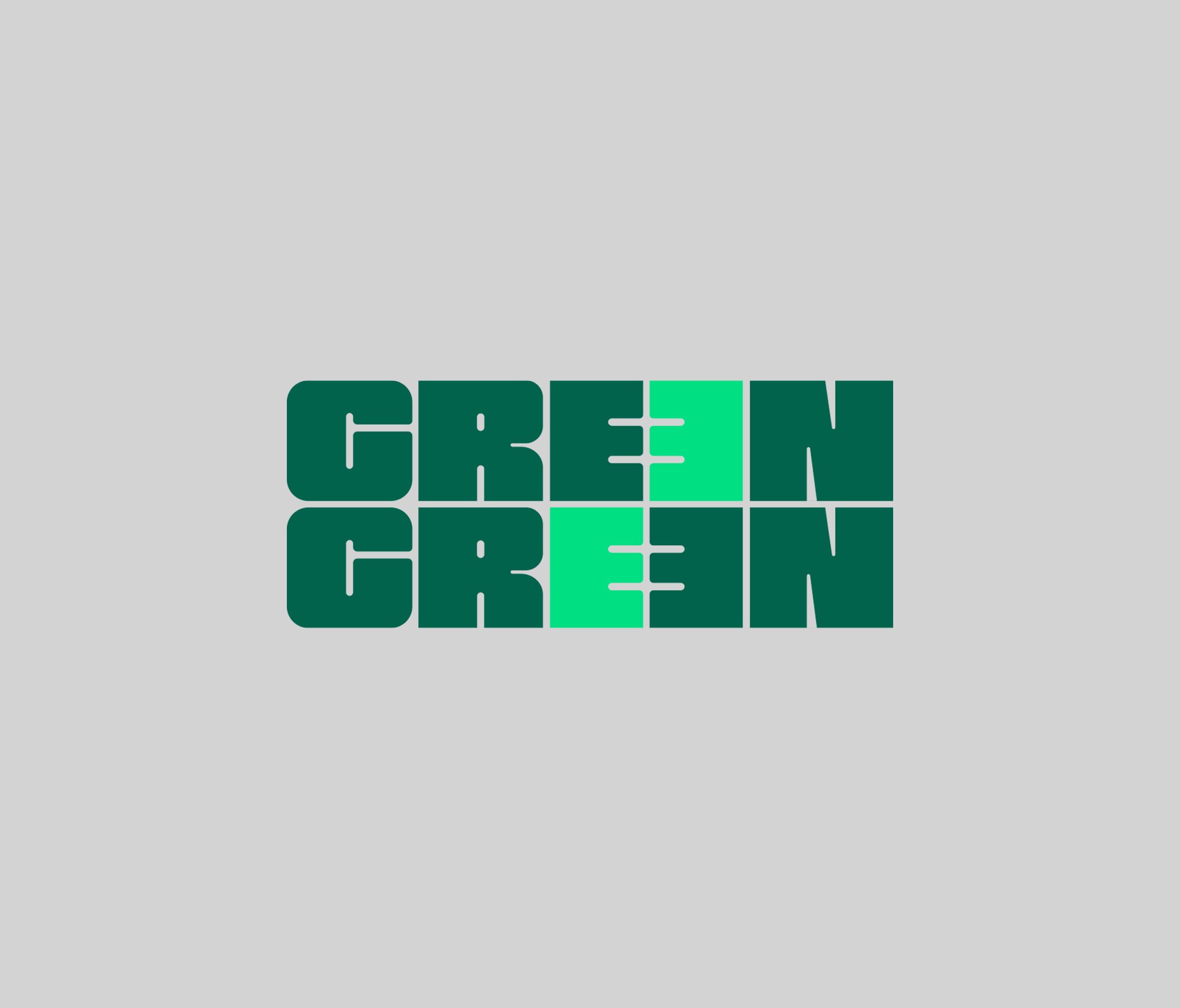
A name that rings twice, with a neon block that shifts between the two words.
04 The approach
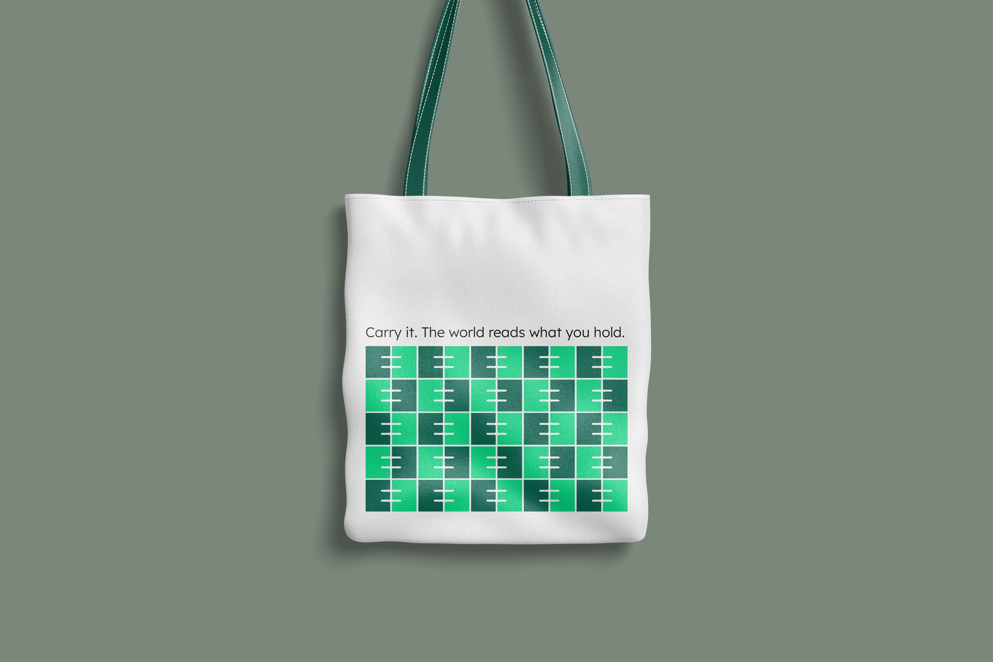
A gridded wordmark built to scale down to a woven patch and to repeat into an all-over pattern on a tote bag.
The mark in motion
A 3D render of the logo, pushing the identity beyond flat design.
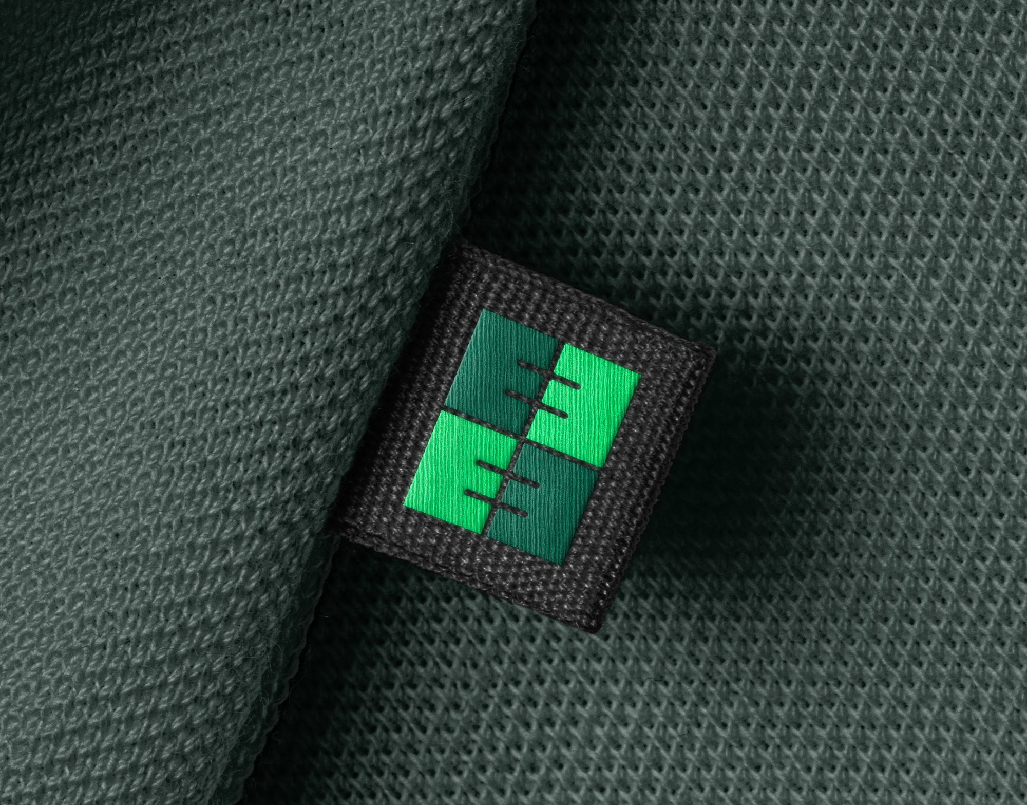
Built to scale down
The neon-accented E block works on its own at small sizes, as a badge or woven patch. Stitched onto fabric, it reads as a signal rather than just a logo.
The bag that says it twice
The all-over pattern repeats the logomark into a grid of signals, each one a small alarm. On a tote bag, a daily object, the brand becomes a statement carried around the city.