← All work 009 Green-Got
Your money can regreen Africa.
01 The brief
Green-Got’s creative business case: four exercises in graphic design, motion art direction, critical analysis and merchandise.
02 The observation
Before drawing anything, I wanted to understand how Green-Got speaks in images. One geometric typeface, two repeated layouts, media always set in rounded cards: a clear, coherent and recognisable system.
03 The insight
The brand colour isn’t the bright green you’d expect, but an almost black olive. Chartreuse only appears as a signal. It’s a posture: no eco-naivety, a serious, almost editorial register where credibility lives in the design itself.
04 The idea
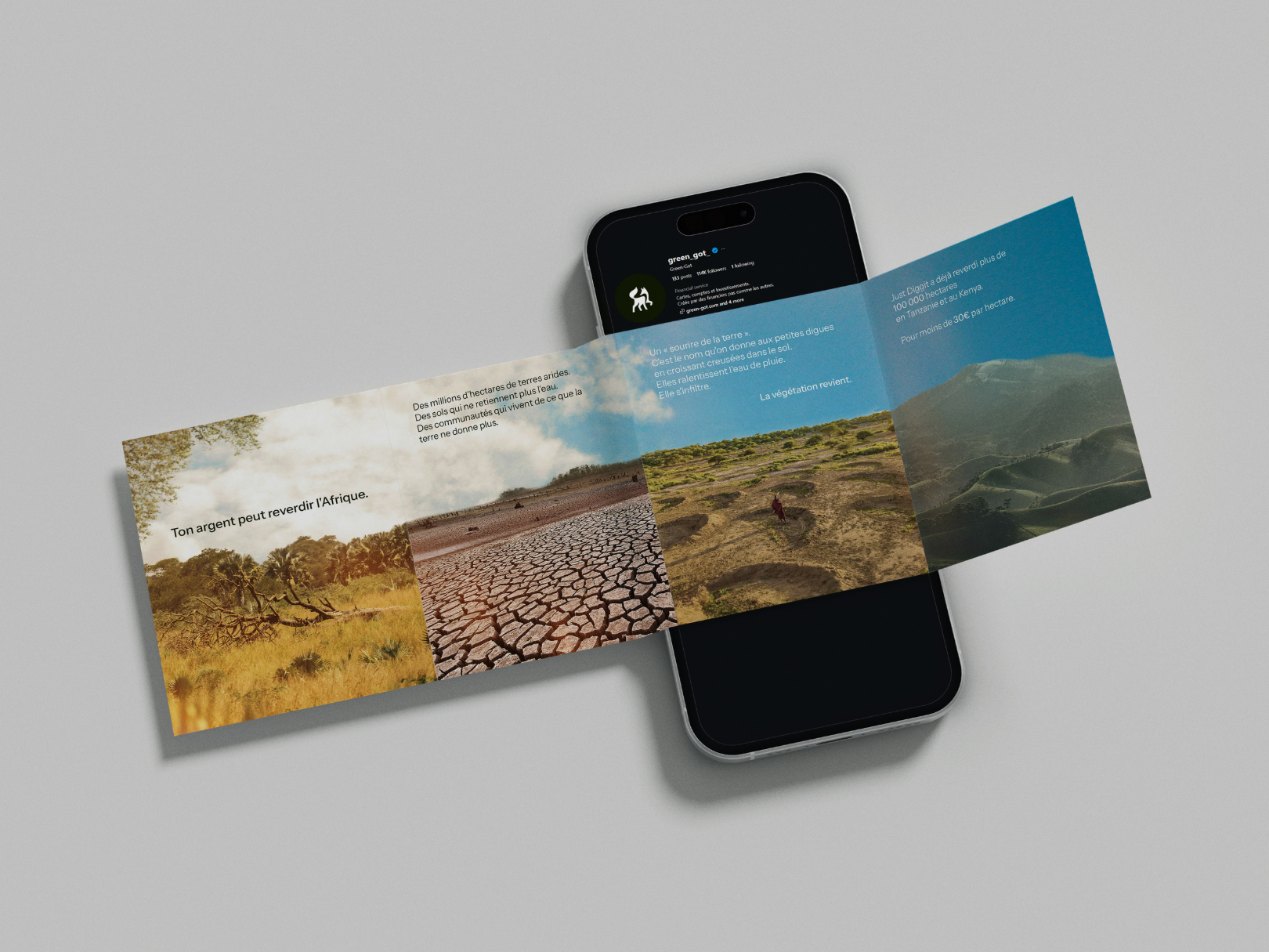
A panoramic carousel where one image runs from slide to slide and the swipe drives the story. The land dries out, then turns green again: the transformation isn’t illustrated, it’s lived.
Analysis
Green-Got’s feed, taken apart from an art direction angle before designing anything.
Moodboard
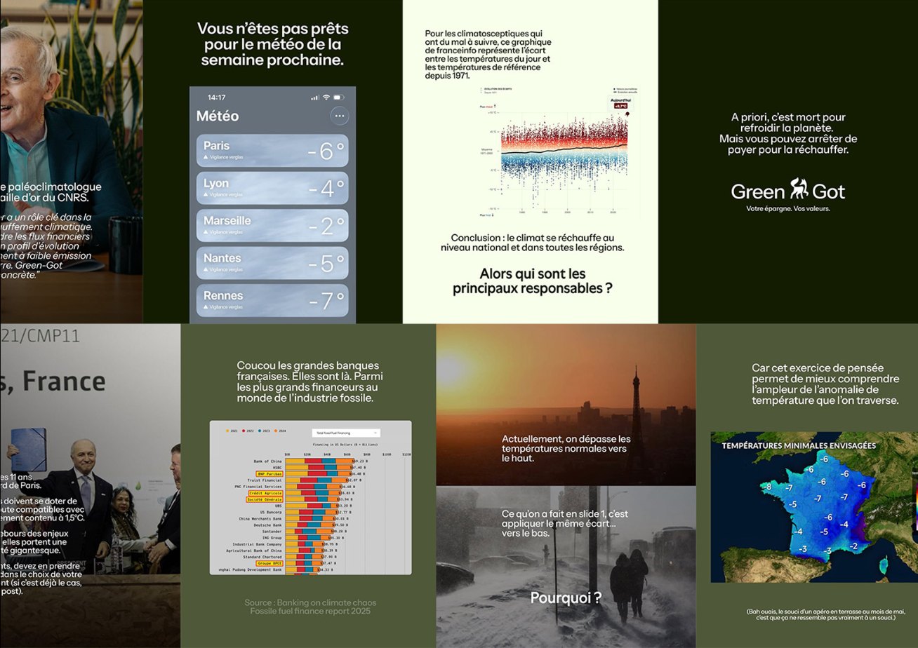
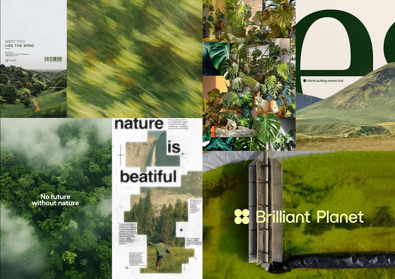
Palette, typography, photo treatment and rhythm. Photos are documentary, never generic stock, and all graded toward the olive palette so that distinct visuals read as one film.
Carousel: Just Diggit
Seven slides. Slides 1 to 4 form one continuum in the same olive grade: the land degrades, then regreens with every swipe. Once the land is restored, the image gives way to the message (figures, mechanism, call to action) on flat backgrounds, in the brand’s sober register. Emotion first, proof second. The opening slide is treated like a cover, centred to stop the scroll; the rest aligns to the top for reading.

Motion: Autopsie
A format that bets on absence: no host, no face. Voice-over and image carry the story alone. The first fifteen seconds aren’t only about holding the viewer, they have to earn their trust. A calm aerial shot signed by the title, then David’s comment pops up like a notification while the car and the charging point roll by. The fake news is set on screen, ready to be taken apart.
Merchandise: the bottle
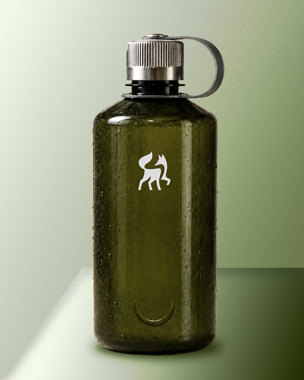
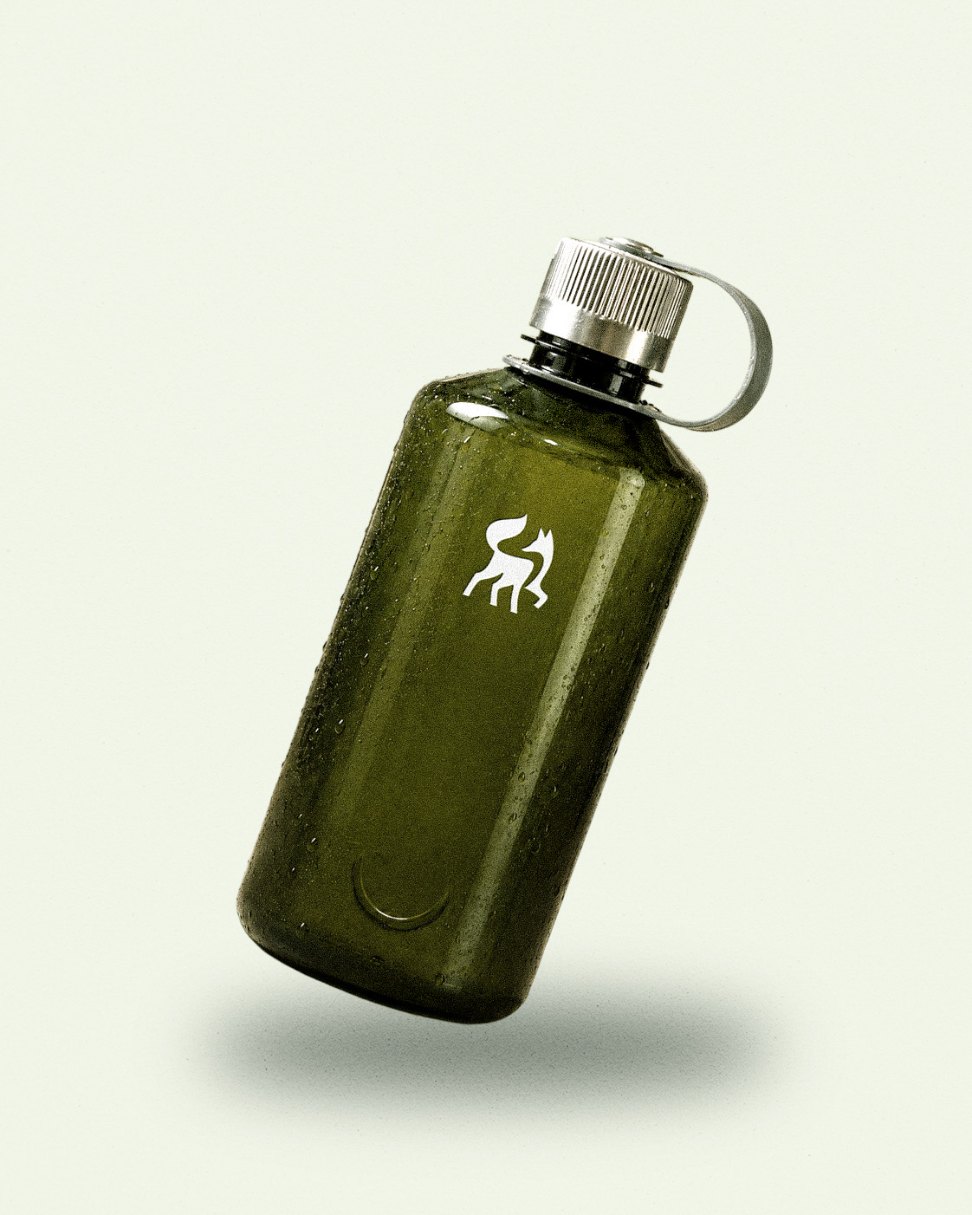
A Nalgene 1L, a classic turned cult object: transparent, unbreakable, BPA-free and made from post-consumer recycled plastic. Not a gadget, an object that lasts. I reduced the design to the essential: the translucent olive tint carries Green-Got’s colour, the logo works as a discreet signature rather than an ad, and a textured metal cap with a debossed detail adds premium quality without noise. Eco-responsible, without the eco clichés.